
The 7 pillars of user experience design
We've already went through a primer on User Experience. Although we try to keep things simple, user experience design is huge topic that is very hot right now which means you never know "enough". However, it is also obvious that most of us do not have time to research and assimilate all the literature regarding this fascinating topic so I decided to share the 7 pillars of user experience design which you can keep in mind when designing… anything!

Are you using Gmail? I am. Before the latest update, Gmail had a very clear text navigation on top of the page — Calendar, Drive, Sheets and other Google services were readily available at the click of a button.
Then Google decided to “simplify” and move everything behind an abstract icon. The result? Most people never noticed the icon and Gmail started to receive a flurry of support requests.
People avoid and often ignore things they cannot understand — that's basic human nature. Avoid designing interface elements that make people wonder what they do, because no one will bother finding out.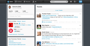
Look at the Twitter screen above. Do you think new users understand what they're supposed to do?
Obviously, they should start tweeting. However, the “Compose new tweet” button in the top right corner isn't very clear (see principle of clarity) and the input box in the left sidebar pretty much blends with the environment. From a design standpoint, it seems like Twitter wants users to either search for something or use one of the options from the left hand navigation menu, as those interface elements are most prominent.
Users should never wonder what to do next — the preferred action should be obvious.
How do you edit your name on Facebook? You go to Settings in the top right corner, click Account settings, find Name, and click Edit. How do you do the same thing on LinkedIn? You click the pencil next to your name.
Users will always expect to see interface elements in the context of object they want to control. This corresponds with real-life: when you want to pop some corn, you go to microwave and flip the switch on thedevice.
It wouldn't be very practical if your microwave instructed you to go down the stairs, open the basement, find the electricity box and pull the switch G-35 to start the popcorn program (which is similar to the Facebook's name-change example).
Keep things handy for users — if something can be edited, changed or otherwise controlled, place those controls right next to it.
Are you familiar with the ringtone above? Of course you are — it was once the most popular ringtone on the planet. Why? It was the default ringtone and most people never changed it.
Defaults are powerful:
There is a big difference between expecting users to do something on their own, and asking them specifically to do it.
For example, when LinkedIn introduced Endorsements feature, it did not expect users to figure out how to use it. Instead, they created highly visible call-to-action banners which appeared right above profile pages. This, combined with the fact that people like giving endorsements, made this feature a huge success.
The lesson: if you want users do to something, ask them without hesitation.
This is simple logic — the more users feel your interface is communicating an action, the more confident they will feel.
Gmail is a great example of good feedback. You will get a clear notification for every action you take, includingLearn more and Undo links. This makes people feel in control and makes them confident to use the product again.
Compare the form on the left to the one on the right. Both have similar number of fields, but the right is much easier to manage.
We all hate filling out long, complicated forms because they seem boring, overwhelming and hard to double-check. But if you split the form into several steps and show a progress bar, things become pretty manageable.
This is the principle of easing — people will rather complete 10 small tasks than one giant task. Small tasks are not intimidating and give us a sense of accomplishment once we complete them.
So there you have it, the 7 pillars of user experience design. I'm sure all these have resonated with you and hopefully they will come back to you when you're designing or assessing the user experience of your product.
Also, you can find some great book suggestions here.
via 99designs
1. Principle of clarity
The user will avoid interface elements without a clear meaning.
Are you using Gmail? I am. Before the latest update, Gmail had a very clear text navigation on top of the page — Calendar, Drive, Sheets and other Google services were readily available at the click of a button.
Then Google decided to “simplify” and move everything behind an abstract icon. The result? Most people never noticed the icon and Gmail started to receive a flurry of support requests.
People avoid and often ignore things they cannot understand — that's basic human nature. Avoid designing interface elements that make people wonder what they do, because no one will bother finding out.
2. Principle of preferred action
The user will feel more comfortable when they understand what the preferred action is.
Look at the Twitter screen above. Do you think new users understand what they're supposed to do?
Obviously, they should start tweeting. However, the “Compose new tweet” button in the top right corner isn't very clear (see principle of clarity) and the input box in the left sidebar pretty much blends with the environment. From a design standpoint, it seems like Twitter wants users to either search for something or use one of the options from the left hand navigation menu, as those interface elements are most prominent.
Users should never wonder what to do next — the preferred action should be obvious.
3. Principle of context
The user expects to see interface controls close to the object he wants to control.
How do you edit your name on Facebook? You go to Settings in the top right corner, click Account settings, find Name, and click Edit. How do you do the same thing on LinkedIn? You click the pencil next to your name.
Users will always expect to see interface elements in the context of object they want to control. This corresponds with real-life: when you want to pop some corn, you go to microwave and flip the switch on thedevice.
It wouldn't be very practical if your microwave instructed you to go down the stairs, open the basement, find the electricity box and pull the switch G-35 to start the popcorn program (which is similar to the Facebook's name-change example).
Keep things handy for users — if something can be edited, changed or otherwise controlled, place those controls right next to it.
4. Principle of defaults
The user will rarely change default settings.Are you familiar with the ringtone above? Of course you are — it was once the most popular ringtone on the planet. Why? It was the default ringtone and most people never changed it.
Defaults are powerful:
- Most people have a default background and ringtone on their phones.
- Most people (including you) never change factory settings on their TV sets.
- Most people will never change the default fridge temperature.
5. Principle of guided action
The user will probably do something if he is asked to do it.
There is a big difference between expecting users to do something on their own, and asking them specifically to do it.
For example, when LinkedIn introduced Endorsements feature, it did not expect users to figure out how to use it. Instead, they created highly visible call-to-action banners which appeared right above profile pages. This, combined with the fact that people like giving endorsements, made this feature a huge success.
The lesson: if you want users do to something, ask them without hesitation.
6. Principle of feedback
The user will feel more confident if you provide clear and constant feedback.
This is simple logic — the more users feel your interface is communicating an action, the more confident they will feel.
Gmail is a great example of good feedback. You will get a clear notification for every action you take, includingLearn more and Undo links. This makes people feel in control and makes them confident to use the product again.
7. Principle of easing
The user will be more inclined to perform a complex action if it's broken down into smaller steps.
Compare the form on the left to the one on the right. Both have similar number of fields, but the right is much easier to manage.
We all hate filling out long, complicated forms because they seem boring, overwhelming and hard to double-check. But if you split the form into several steps and show a progress bar, things become pretty manageable.
This is the principle of easing — people will rather complete 10 small tasks than one giant task. Small tasks are not intimidating and give us a sense of accomplishment once we complete them.
So there you have it, the 7 pillars of user experience design. I'm sure all these have resonated with you and hopefully they will come back to you when you're designing or assessing the user experience of your product.
Also, you can find some great book suggestions here.
via 99designs
Published: Sun, Jan 19 2014 @ 10:30:58
Back to Blog